Bridgerton Season 3's Costumes Include Hidden Meanings In The Colours
16 May 2024, 12:43 | Updated: 16 May 2024, 17:11

If you’re not taking note of the colours used in Netflix’s Bridgerton then you’re missing half the story. From the Featheringtons' yellows to the Bridgertons' blues, here’s the secret meaning behind the costumes.
Listen to this article
Netflix’s Bridgerton season three part one has dropped and if there has been a suspicious amount of sick days called in at your work, then you now know why.
As the nation binges the first half of the highly anticipated series starring Luke Newton as Colin Bridgerton and Nicola Coughlan as Penelope Featherington, sipping their lemonades and fanning their fans, we want to look a little deeper into the show.
Whether you’ve just dipped into this season because you’re a fan of Nicola’s work in Derry Girls, or whether you’re a diehard Bridgertonian, something you’ll have noticed right away is the glorious amount of colour used in the show.
- Read more: How Old Is Penelope In Bridgerton Season 3? Her Age And Colin's Age Revealed
- Read more: Bridgerton Season Three Soundtrack And Every Orchestral Cover

The use of colour in the costumes for Bridgerton wasn't just for aesthetics, every shade used has been intentional and tells a little more about the story of that character.
After all Britain’s Regency Era wasn’t exactly known for being a liberated period, so what the characters cannot say themselves, their costumes have managed to express.
Here's what they mean, and how they're used to transform certain characters.

Bridgerton blue
Blue has to be the most iconic colour for the show, after all, it’s used for the family the series is named after.
Fans have dubbed it ‘Bridgerton blue’ after noticing that the Bridgertons incorporate the colour in some way, shape or form, not just in their costumes but also in the interior decor of their home.
Production Designer Will Hughes-Jones spoke to Town and Country explaining that the shade of blue they went with was reminiscent of Wedgewood blue.
The same blue that during that period would have been used in expensive ceramics and fine china. What the usage of this blue has done is emphasised the Bridgerton’s class and social status.
The team hasn't shoved it in the audience's face, instead the colours used subconsciously helped us associate the family with wealth.

Penelope Featherington's yellow
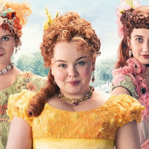
This season revolved around Penelope Featherington and it’s of the utmost importance that the audiences understood her colour journey. Penelope has, up until this season, been clad in the most garish shades of yellow.
At a superficial glance, viewers may have believed the yellow suited her bubbly, sunny personality. However, Penelope disliked the colour her mother picked out for her and even said so on the show.
According to the Jane Austen Centre, yellow was considered one of the most popular shades for young women to wear during the Regency Era, this highlighted how important social standing was to Penelope’s mother, at any cost.

However, she does a poor job of it, as the Featherington’s ostentatious colour palette served as a comedic reminder of how they do not fit in in high society. Instead of a delicate daffodil yellow, the bright yellows used highlighted a classlessness for the family.
Whilst yellow has had a lot of positive associations, it can also represent deceit, enlightenment and cowardice which directly relates to Penelope’s covert operations as Lady Whistledown.
Penelope’s 'enlightenment' was her intelligence and ability to see through the facades of the Ton and write them wittily as Whistedown, however simultaneously, we’ve witnessed firsthand how her deceit and cowardice led to the downfall of her best friend Eloise Bridgerton.

But in season 3, we’ve seen Penelope grow as a young woman and move away from the yellows and start wearing deep greens and Bridgerton blues.
Not only do these colours enhance her natural beauty, but they represent Penelope’s desire to remove herself from her mother, associate herself with the palette of the Bridgertons and leave behind her cowardly ways.
The most exciting of all was the fact that green is a combination of blue and yellow on the colour wheel.
And as Colin Bridgerton (blue) and Penelope Featherington (yellow) fall in love, we think we can expect from greens in Colin’s outfits in the future too.

White and pink costumes in Bridgerton are all about the romance
The young Bridgerton women were often donned in whites, pinks and light blues which highlighted their youth and innocence. Daphne Bridgerton almost exclusively dressed in lighter pastels, alongside Edwina Sharma in season 2, who only wore light pink.
These colours were incredibly soft and romantic and they revealed just how naive these girls were during their seasons. But it’s worth noting that Daphne’s colour palette changed after her marriage to the Duke of Hastings.
She went from whites and light blues to deeper more bodied lilacs and purples. Why? Well, the same colour theory existed for this couple as it did for Penelope and Colin.
The Duke and Lady Danbury’s colours were always reds and crimsons to highlight their closeness to royalty, and red combined with Bridgerton blue made purple.

The Sharma sisters wore jewel tones
Kate Sharma’s jewel tones stood out in season 2 amongst the pastels and frills of the rest of the Ton.
Her deeper shades not only highlighted the gorgeous tones in her skin, they were also are a nod to the types of dyes that were being made and exported from India at the time.
The colours and textures Kate wears paralleled the styles used in traditional sari garbs from her motherland, however in Regency England, she stuck out like a sore thumb, further enforcing that she did not fit into that society.
However, the soothing darker shades hinted at her maturity as a woman. She was in stark contrast to the youth and jubilant nature of Edwina who wore the lighter shades.

Read more about Bridgerton here:
- Bridgerton Boss Confirms Queer Romances Will Appear In Future Seasons
- Bridgerton Bosses "Committed" To Making All 8 Seasons At Netflix
- Bridgerton's Nicola Coughlan says Penelope and Colin's sex scenes are 'the best so far'
- Who is Lord Debling in Bridgerton season 3? Is he in the books?
- Bridgerton boss explains why they skipped Benedict's story in season 3
WATCH: Bridgerton Cast vs. 'The Most Impossible Bridgerton Quiz'

Bridgerton Cast vs. 'The Most Impossible Bridgerton Quiz'
